Introduction
This blog post is the second in a four-part series about my work with energy social science data curation at the Carnegie Mellon University Libraries (University Libraries hereafter) and the Wilton E. Scott Institute for Energy Innovation (Scott Institute hereafter). In this post, I’ll describe my collaboration with Ana Cáceres, a recent Ph.D. graduate (Engineering and Public Policy & Civil and Environmental Engineering, 2022), to create the interactive dashboard RICCH (Risks and Impacts of Climate Change on Hydropower). This collaboration showcases some of the data service support provided by the University Libraries to advance open scholarship.
Brief context of the research project
One key research question of the RICCH project is: How does climate change impact the capacity of hydropower plants in the Global South? This project simulates the hydropower capacity at the power plant level in response to global climate model simulations of temperature and precipitation under different greenhouse gas emission scenarios. After simulation, the results must be communicated effectively. An interactive dashboard is a great way to achieve this by making the results of the study more immediately visible and accessible to a broader audience.
What did we want this dashboard to do?
At a high level, we wanted this dashboard to show simulation results (i.e., monthly hydropower capacity) for each power plant based on user inputs. These user inputs are major factors that will have an impact on the simulated hydropower capacity (e.g., climate model, emission scenario, and time frame). Due to the existence of many hydropower stations in the Global South, one of the main functions of the dashboard is to allow users to select hydropower stations on a map.
Major features
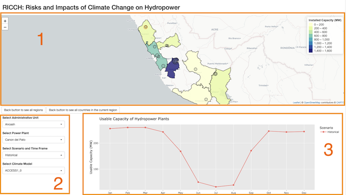
The dashboard has three components:
- Map: We place each hydropower plant based on its longitude and latitude on the map in a circle. For each circle (i.e., each hydropower plant), users can see its name and installed capacity on mouseover. To make it easier for users to navigate through the map, the power plants are grouped by two levels: country and administrative region (e.g., state or province). When users first land on the map, they will first see the relevant countries color-shaded by the country-wide installed capacity (choropleth map). After a country is clicked, the map will zoom in onto the country clicked, and users will see another choropleth map by the administrative-region-wide installed capacity.
- Four dropdown menus: After a country is clicked, the first two dropdowns allow users to filter and select plants by administrative region and power plant name. The third dropdown is for emission scenario and time frame (e.g., RCP 4.5 - 2070-2099). The last one is for 21 climate models (the simulations are based on the 21 General Circulation Models in the NASA’s NEX-GDDP dataset).
- Visualization output: A line graph shows the simulated hydropower capacity by month. Each line represents one emission scenario and time frame. If multiple plants or multiple climate models are selected, the line will represent the average capacity. If multiple climate models are selected, there will also be a ribbon around the line. The ribbon shows the maximum and minimum values in a multi-model spread.
A screenshot of the RICCH dashboard showing the three components:
Luling Huang, CLIR Postdoctoral Fellow in Data Curation for Energy Social Science
Implementation in R Shiny
Because we wanted to adopt best practices in open scholarship, we chose the open source R package called Shiny to develop the dashboard. If you are familiar with coding in R, it would be fairly easy to pick up Shiny and start creating your first interactive dashboard. There are numerous free web resources on learning and using Shiny. Personally, to avoid frequent coding mistakes, I find it very beneficial to fully understand the concept of reactivity in R.
Here is the fun part
We deployed RICCH via shinyapps.io. Feel free to explore the various features of the dashboard. If you have any comments or questions, just send me an email: lulinghuang@cmu.edu
Next steps
We are preparing both the RICCH data and the RICCH R code for public use. We’ll keep you updated.
Stay tuned to my next two posts. They will cover (1) my work with a research team to clean and analyze a large dataset of electricity consumption to study energy poverty and justice in the U.S.; (2) the takeaways from a research data management survey and interview series that I’ve been conducting among the CMU energy research community.
Acknowledgments
Many thanks to my collaborator Ana Cáceres (Engineering and Public Policy & Civil and Environmental Engineering, 2022), and Aiswariya Raja (former Research Associate, Scott Institute). My fellowship has been supervised by Rikk Mulligan (Digital Scholarship Strategist, University Libraries) and Anna Siefken (Executive Director, Scott Institute). This fellowship is made possible in partnership with the Council on Library and Information Resources (CLIR), with the generous support of the Alfred P. Sloan Foundation.
References with links (by order of appearance)
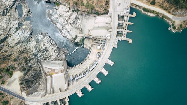
The Rapel Dam, Chile. Photo by Francisco Kemeny on Unsplash. Free to use under the Unsplash License, https://unsplash.com/photos/xoezaq6Htwo Wilton E. Scott Institute for Energy Innovation, https://www.cmu.edu/energy/ Council on Library and Information Resources, https://clir.org/ Choropleth map, https://en.wikipedia.org/wiki/Choropleth_map Representative Concentration Pathway (RCP), https://en.wikipedia.org/wiki/Representative_Concentration_Pathway General Circulation Model, https://en.wikipedia.org/wiki/General_circulation_model NASA Earth Exchange Global Daily Downscaled Projections (NEX-GDDP), https://www.nccs.nasa.gov/services/data-collections/land-based-products/nex-gddp Shiny, https://www.rstudio.com/products/shiny/ How to understand reactivity in R, https://shiny.rstudio.com/articles/understanding-reactivity.html RICCH, https://ricch.shinyapps.io/hydro-shiny/ shinyapps.io, https://www.shinyapps.io/
If you haven’t, check out my previous post on working with the Dimensions database.
Luling Huang, CLIR Postdoctoral Fellow in Data Curation for Energy Social Science
The Rapel Dam, Chile. Photo by Francisco Kemeny on Unsplash. Free to use under the Unsplash License.